Key Takeaways
Is your "Submit" button killing your profit? To scale to 4x ROAS and beyond, you need more than just traffic—you need the "irresistible click." This guide dives deep into the evolution of CTAs, from basic text links to AI-powered wizards like Intelliassist. Learn how to master design hierarchy, psychological triggers, and ethical urgency to turn browsing strangers into loyal customers without ever being "creepy."
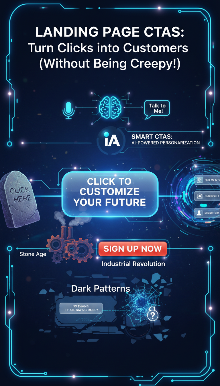
Landing Page CTAs: Turn Clicks into Customers (Without Being Creepy!)
Master the art and science of the irresistible click – from design to psychology, and beyond.
I. Intro: Your Landing Page's Little Powerhouse
A. Ever hit a button online that just feels right? That electric jolt of "Yes, this is exactly what I wanted!"? That's the magic of a great Call-to-Action (CTA)! It's not just about aesthetics, it's about aligning with a user's implicit need.
B. What exactly is a CTA, and why is it the MVP for getting folks to do what you want on your e-commerce site? It's more than just a button; it's a carefully crafted invitation, a gentle nudge in the right direction. It's the distillation of desire into a single, clickable point.
C. Buckle up! We're diving deep into CTAs, from their humble beginnings – think crude, blinking GIFs – to their AI-powered future, uncovering the secrets to making them irresistible. We'll explore not just how to create effective CTAs, but why they work, and the ethical considerations that must guide their development.
II. The Grand Tour: A Whirlwind History of the CTA
A. The Stone Age (Early Internet): "Click Here" was cutting-edge! Imagine the Wild West of the internet, where websites were digital pamphlets and CTAs were basic, underlined text links, bravely pointing you to the next page. Simple, direct, and, let's be honest, a little... boring. Think of it as the equivalent of shouting "Next!" in a crowded market.
B. The Industrial Revolution (Mid-Evolution): Buttons emerged! A technological leap! Colors, bigger fonts, and phrases like "Sign Up Now" or "Get Started" began to appear, mimicking the bold pronouncements of industrial-era advertising. Social media platforms, in their nascent forms, even got in on the action, experimenting with calls to "Friend" or "Follow."
C. The Digital Age (Modern Era): CTAs became sophisticated. Think bold designs, psychological triggers, and a real understanding of what makes us click. We moved from simply telling people what to do to understanding why they might want to do it. The focus shifted from blunt instruction to subtle persuasion.
III. The Art & Science of the Irresistible Click: Modern CTA Mastery
A. Design That Demands a Double-Take:
- Pop Art, Not Blah Art: Your CTA needs to pop! We're talking high-contrast colors (bold green or orange on light themes work wonders!), generous size, and plenty of whitespace around it so it's not fighting for attention. Think Warhol, not beige.
- Thumb-Friendly Fun: Most people are on their phones. Make those buttons big, tappable, and give them enough padding so no one's accidentally hitting the wrong thing. Consider the haptic experience too. A slight vibration on tap can increase the sense of deliberate action.
B. Words That Work Wonders (No More "Submit"!)
- Be a Mind Reader (and a Benefit Giver): Ditch generic terms. Strong CTAs are specific, tell the visitor exactly what they'll get (a discount? a quiz result?), and use action verbs. Promise value, not just function.
- Matchmaker, Matchmaker: Is your visitor just browsing, evaluating, or ready to buy? Your CTA needs to align perfectly with their current mindset. No hard selling too early! Think of it as a dance – you need to lead, but not too aggressively.
- The FOMO Factor (Ethically Speaking): Phrases like "Claim This Limited-Time Offer" or "Get 20% Off Today" create urgency and highlight value. Just make sure it's genuine! Empty threats erode trust.
- The Personal Touch: "Start My Free Trial" often works better than "Start Your Free Trial." A little personalization goes a long way. It speaks directly to the individual, making them feel seen.
C. Strategic Placement: Location, Location, Location!
- Above the Fold is Gold: Get that primary CTA visible the moment someone lands on your page. First impressions matter, and the CTA is your first offer.
- Don't Be a One-Hit Wonder: On longer pages, repeat your CTA after key sections (like testimonials or pricing) and again at the very bottom for those decisive readers. Reinforce the message, but avoid being repetitive. Subtle variations can help.
- Keep it Simple, Superstar: Too many different CTAs can confuse people. Focus on one primary action per page to avoid "choice paralysis." Guide the user, don't overwhelm them.
IV. Your CTA Idea Buffet: 25 High-Converting Examples for E-commerce (Powered by Smart Tech)
A. "Show Me the Money!" CTAs (Direct Purchase):
Think "Add to Bag," "Buy It Now," "Checkout Securely." Perfect for high-intent shoppers. These are the declarations of intent, the flags planted on the summit of the purchasing decision.
B. "Who Doesn't Love a Deal?" CTAs (Discount & Offer-Driven):
"Get 20% Off Today," "Unlock My First-Order Discount." Convert those price-sensitive visitors. The siren song of savings, a powerful motivator for many.
C. "Just Looking, Thanks!" CTAs (Discovery & Browsing):
"Shop the Collection," "Explore Bestsellers." Great for cold traffic or those still exploring. A gentle invitation to browse, a welcome mat for the curious.
D. "Tell Me More About ME!" CTAs (Quiz & Personalization):
"Take the 1-Minute Quiz," "Find My Perfect Routine." Engage and guide users to tailored recommendations. Turn browsing into a journey of self-discovery.
E. "Set It & Forget It" CTAs (Subscription & Replenishment):
"Subscribe & Save 15%," "Start My Monthly Plan." Build recurring revenue effortlessly. The promise of convenience and consistency.
F. "Proof's in the Pudding" CTAs (Social Proof & UGC Funnel):
"See Why Customers Love It," "Watch Real Results." Leverage community wisdom. The persuasive power of peer endorsement.
G. "Don't Leave Me!" CTAs (Retention, Referral & Post-Purchase):
"Join Our Rewards Club," "Share & Give ₹X, Get ₹X." Keep customers coming back for more. Cultivating loyalty and encouraging advocacy.
Behind the scenes: Tools like Intelliassist help pick the right CTA for your campaign goal and test what works best, so you don't have to guess! These tools offer A/B testing and real-time optimization, ensuring that your CTAs are constantly evolving to maximize conversion rates.
V. The Dark Side of the Click: When CTAs Go Rogue
A. What Are "Dark Patterns?" Not all CTAs play fair. Some sneaky designs trick you into doing things you didn't mean to, like signing up for something you don't want or spending more money. They exploit cognitive biases and vulnerabilities for profit.
B. The Rogues' Gallery:
- Hidden Costs: Surprise! Shipping fees appear at the last minute. A classic bait-and-switch tactic that breeds resentment.
- Fake Urgency: "Only 2 left in stock!" when there are actually hundreds. The boy who cried wolf eventually loses his audience.
- Subscription Traps: Easy to sign up for a free trial, impossible to cancel. A digital Roach Motel – easy to get in, impossible to get out.
- Confirm shaming: Guilt-tripping you into opting in ("No thanks, I hate saving money"). An emotionally manipulative tactic that preys on insecurities.
C. Why We Should Care:
These tactics erode trust, damage brand reputation, and can lead to buyer's remorse. Regulators are starting to take notice. A short-term gain can lead to long-term reputational damage.
D. The Ethical Imperative:
Good CTAs guide, they don't coerce. Transparency and empowering user choice are key. Build trust, not walls.
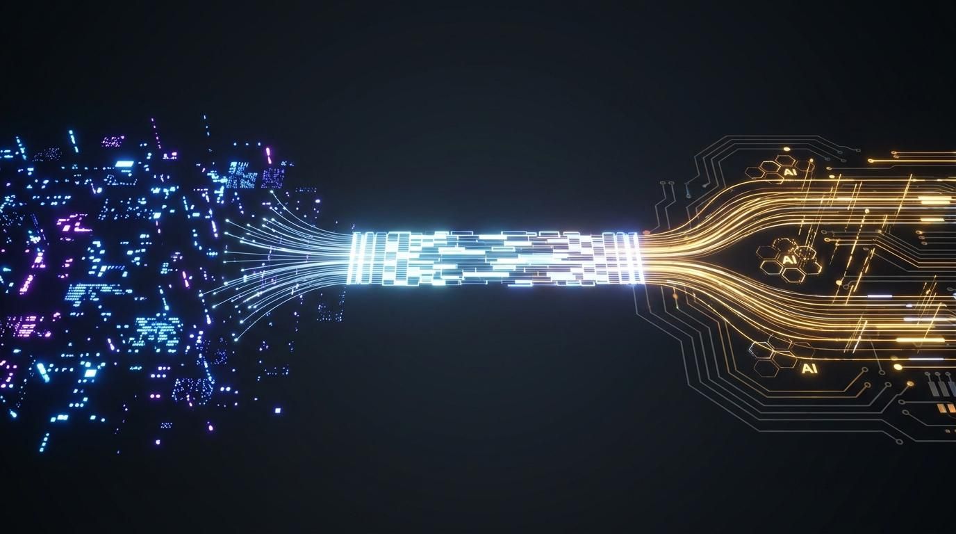
VI. Gazing into the Crystal Ball: The Future of CTAs (Hello, AI!)
A. Smart CTAs Take Over:
Forget generic buttons! AI will analyze your behavior in real-time, serving up the most relevant CTA just for you. (Imagine Intelliassist dynamically swapping offers as you scroll!) The rise of personalized persuasion, tailored to individual needs and preferences.
B. Talk to Me!
With voice search on the rise, CTAs will become more conversational, designed to respond to natural language queries. "Alexa, add this to my cart!" The merging of voice and commerce.
C. Interactive Fun:
Quizzes, calculators, personalized assessments – CTAs will become engaging mini-experiences, not just static buttons. From passive to active engagement, turning the CTA into a participatory event.
D. The Data Backbone:
Cleaner data and tighter CRM integration will fuel even deeper personalization, ensuring CTAs are hyper-relevant without being intrusive. Data as the fuel for intelligent persuasion, but with a responsibility to protect user privacy.
E. The Ethical AI Challenge:
As AI gets smarter, ensuring it's used responsibly to help users, not trick them, will be a major ongoing discussion. The crucial question of algorithmic ethics and the need for transparency and accountability in AI-driven marketing.
VII. Conclusion: Your Call to Action (Seriously!)
A. From simple text to AI-powered wizards, CTAs have come a long way and are more crucial than ever for e-commerce success.
B. By mastering the blend of compelling copy, smart design, strategic placement, and ethical practices, you can turn more browsers into happy customers.
C. Ready to supercharge your landing pages and make your CTAs truly click-worthy? It’s time to rethink your buttons! It's time to move beyond the superficial and delve into the psychology of persuasion.
Re-think Your CTAs Now!
Share this article
Help others discover this content