Key Takeaways
From Clicks to Customers: Website Design That Converts Into Sales
In the world of web design, it's easy to get caught up in the latest trends—complex animations, flashy visual effects, and intricate layouts. While these might win design awards, they often fail at the most crucial task: turning a visitor into a customer. The truth is, the most effective websites aren't necessarily the most visually spectacular. They are the ones that are strategically designed to convert.
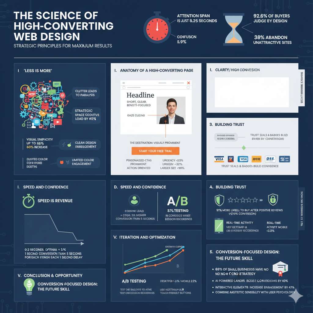
The stakes are higher than ever: with the average human attention span now down to just 8.25 seconds and 38% of users abandoning websites if they find them unattractive, your website has mere moments to capture attention and guide visitors toward conversion. Research shows that 92.6% of buyers say a website's design affects their buying decision, making strategic design choices critical for business success.
So, how do you build a website that doesn't just look good, but also drives sales? The secret lies in a combination of minimalist design, a crystal-clear purpose, and a user-centric approach. Let's break down the essential principles for creating landing pages that work.
The 'Less is More' Philosophy: Why Minimalist Design Wins
When a potential customer lands on your page, you have only a few seconds to capture their attention and convey your message. Research from the Nielsen Norman Group demonstrates that clean web design and simple branding can increase user engagement by up to 67% compared to cluttered interfaces. If visitors are met with a barrage of spinning icons, auto-playing videos, and competing calls-to-action, their immediate reaction is often confusion, not conversion.
The psychology behind minimalist design is compelling: visual simplicity can lead to a remarkable increase in conversion rates—sometimes up to 60%. When users are presented with fewer choices, they experience less decision paralysis, which facilitates decision-making and prompts them to complete their purchases. In fact, one in three online shoppers abandon their carts if a site feels too cluttered.
Excessive animations and visual clutter can distract from your primary goal. A simpler, cleaner landing page, on the other hand, does the opposite. It provides a clear path for the user, making it easy for them to understand what you offer and what you want them to do next. By removing non-essential elements, you place the focus squarely on your value proposition and your call-to-action, significantly improving the chances of a visitor taking the desired step.
Key minimalist principles that drive conversions include:
- Strategic use of white space to reduce cognitive load by 40%
- Limited color palettes that improve aesthetics and usability
- High-quality visuals that reinforce brand identity without overwhelming the design
- Simplified navigation with intuitively organized links
Define Your Destination: The Core Goal of a Landing Page
Before a single pixel is placed, you must answer one fundamental question: What is the single most important action I want a visitor to take on this page?
The main purpose of a landing page is to drive a specific action—whether it's clicking a "Buy Now" button, signing up for a newsletter, or filling out a contact form. Every single element on the page, from the headline to the images to the button copy, must work in harmony to support this one goal. Focusing on a single, clear action drastically improves conversion rates, as confirmed by extensive conversion optimization research.
If your page tries to do too many things at once (e.g., "Buy our product! And also follow us on social media! And read our blog!"), you dilute the primary message and confuse the user, leading to paralysis and a lost sale. This principle, known as Hick's Law, demonstrates that the time it takes to make a decision increases with the number and complexity of choices available.
The Anatomy of a High-Converting Landing Page
While every business is different, a successful landing page generally follows a proven formula designed for clarity and impact. Research shows that 50% of consumers believe website design is crucial to a business's brand, making every element count toward conversion success.
A Short, Clear Message: Your headline and supporting text should immediately tell visitors what value you offer. Don't use jargon or vague marketing-speak. Be direct and focus on the benefit to the customer. For example, instead of "Synergistic Cloud Solutions," try "Get Your Team's Files in One Secure Place." Studies show that clear, benefit-oriented headlines can increase conversion rates by up to 161%.
A Strong Call-to-Action (CTA): This is your destination. Your CTA button should be visually prominent, using a contrasting color to stand out. The text on the button should be action-oriented and clear, such as "Start Your Free Trial" or "Get Your Quote Now." Data reveals that personalized CTAs perform 202% better than basic CTAs, and adding urgency to CTAs can increase conversion rates by 332%. Even simple changes like increasing the size of the CTA button can boost click-through rates by 90%.
A Key Visual: A single, powerful image or graphic can communicate your message faster than a block of text. This visual should be relevant and reinforce the value you're offering. It could be a product shot, a diagram explaining your service, or an image that evokes the positive outcome your customer will experience. Remember that the human brain can process visual information 60,000 times faster than text, making your choice of imagery crucial for immediate impact.
Logo and Essential Navigation: Include your logo for brand recognition. If navigation is necessary, keep it minimal. Many high-converting landing pages remove the main site navigation entirely to eliminate distractions and keep the user focused on the single goal of the page.
The Power of Gaze: Using Visuals to Guide Your Visitors
A clever psychological trick to boost conversion is to use your visuals to direct attention. If your landing page features a person or a character, ensure they are looking towards your call-to-action button or sign-up form.
This technique, known as gaze cueing, taps into our natural human tendency to look where others are looking. When a visitor sees the person in the image looking at the CTA, their own eyes are subconsciously drawn to that same spot. This simple adjustment can subtly guide your visitor's attention right where you want it, making them more likely to see and click the button.
The Critical Impact of Page Speed on Conversions
Website performance has a massive, measurable effect on conversion rates. Studies consistently show that fast page speed results in better conversion rates, with the highest ecommerce conversion rates occurring on pages with load times between 0 and 2 seconds.
The numbers are staggering:
- Website conversion rates drop by an average of 4.42% for each additional second of load time between 0 and 5 seconds
- For every second delay in mobile page load, conversions can fall by up to 20%
- A site that loads in 1 second has an ecommerce conversion rate 2.5x higher than a site that loads in 5 seconds
- 70% of consumers say page speed impacts their willingness to buy from an online retailer
Major retailers like Walmart have found that for every 1 second improvement in page load time, their conversion rate increased by 2%. With these kinds of impacts on revenue, optimizing for speed isn't optional—it's essential for conversion success.
Building Trust Through Social Proof
Trust signals are among the most powerful conversion drivers, with 91% of consumers more likely to buy after reading positive reviews. Social proof works because it leverages a fundamental aspect of human behavior—we follow the actions of others, especially when making decisions online.
Effective trust signals include:
- Customer reviews and star ratings: These can increase conversion rates by up to 270%
- Security badges and SSL certificates: Essential for building confidence in your checkout process
- Trust seals and payment method logos: Display familiar icons like Visa, Mastercard, and PayPal
- Real-time activity notifications: Showing recent purchases or current viewers creates urgency
- Expert endorsements and industry certifications: Third-party validation of your expertise
Companies using social proof experience an average 10% increase in sales due to enhanced customer confidence. Tools that showcase real-time customer activity can increase conversions by up to 15%, leveraging both social validation and fear of missing out.
Mobile vs. Desktop: Understanding Device-Specific Conversion Patterns
The mobile-desktop conversion gap remains significant in 2024: while mobile traffic accounts for 63.7% of total website visits, desktop conversion rates still lead with an average of 4.3% versus 2.2% for mobile. This 1.7x higher conversion rate on desktop reflects the challenges of the smaller screen experience and emphasizes the critical importance of mobile optimization.
Key mobile optimization strategies include:
- Optimizing CTAs for mobile devices can improve conversion rates by 32.5%
- Ensuring touch-friendly button sizes and spacing
- Streamlining the checkout process for smaller screens
- Using AMP (Accelerated Mobile Pages) content, which shows 35% longer time-on-page than non-AMP mobile content
Despite lower conversion rates, mobile users are often more inclined to take immediate action, particularly for local businesses and time-sensitive offers. The key is creating a seamless mobile experience that accommodates the unique behaviors of mobile users.
Launch is Just the Beginning: The Importance of Testing and Iteration
Publishing your landing page isn't the end of the process; it's the beginning. You can't know for certain what will work best until you see how real people interact with your design.
A/B testing is one of the most powerful tools for optimization: marketers who regularly A/B test their landing pages experience a 37% increase in conversions by optimizing elements like headlines, CTAs, and visuals. However, only 17% of marketers actively A/B test their landing pages, meaning most are missing valuable optimization opportunities.
After launching, use tools like Hotjar to create heatmaps and watch session recordings. This will show you exactly where people are clicking, how far they're scrolling, and where they might be getting stuck. Are they missing your CTA? Are they confused by your headline? This data is invaluable.
Effective A/B testing focuses on:
- Testing only one element at a time to ensure reliable results
- Running tests for sufficient duration to capture user behavior patterns
- Ensuring statistical significance before implementing changes
- Focusing on high-impact elements like headlines, CTAs, and key visuals
Use these insights to form hypotheses and test changes. Tweak your headline, change your button color, or swap out your main image, and then measure the impact on your conversion rate. Continuous iteration is the key to turning a good landing page into a great one.
Industry Benchmarks: Understanding What "Good" Looks Like
The average conversion rate across all ecommerce sites is 2.9%, but this varies significantly by industry. Understanding these benchmarks helps set realistic expectations:
- Food & Beverage: Highest conversion rates at 8.98%
- Health & Beauty: 2.7% average conversion rate
- Electronics: Higher desktop engagement with 3.6% average conversion
- Fashion/Retail: 1.7% average, with mobile representing 63.7% of traffic
B2B websites show different patterns, with 75% of B2B marketers considering conversion rate the most important metric for understanding landing page performance. Legal services achieve 7.4% conversion rates, while Point of Sale services range from 2% to 5%.
Sharpen Your Skills: How to Become a Conversion-Focused Designer
Mastering the art of high-converting design is an incredibly valuable skill, especially for freelancers and junior designers. With 68% of small businesses having no CRO strategy, there's enormous opportunity for designers who understand conversion principles.
Most companies need effective websites and landing pages far more than they need another mobile app. Here's how you can practice and improve:
Recreate and Analyze: Find successful landing pages and try to recreate them yourself. This process forces you to analyze why certain layouts, color schemes, and copy choices work so well.
Join Design Challenges: Participating in daily or weekly design challenges is a great way to practice quickly and build a portfolio that demonstrates your understanding of real-world business needs.
Focus on Business Goals: Always remember that your role as a designer is to solve a business problem. By focusing on creating designs that drive tangible results like leads and sales, you become an indispensable asset to any company.
Stay Current with Data: Interactive elements increase engagement by 47%, and AI-powered landing pages can boost conversions by 40% through dynamic personalization. Understanding these emerging trends positions you at the forefront of conversion-focused design.
The most successful designers combine aesthetic sensibility with deep understanding of user psychology and conversion principles. In a world where every second of load time matters and every design choice impacts the bottom line, conversion-focused design skills are more valuable than ever.
Share this article
Help others discover this content